Renovating a building without erasing the original architectural imprint requires imagination and restraint. The rooms and facilities were almost completely stripped bare to reconfigure the space and ensure standard, comfortable and energy-saving thermo-acoustic insulation. Our goal, however, was also to preserve the soul of the house.
Nods and nudges
Rather than attempting to recreate what is gone, the architect chose to focus on a few key elements he felt represented the original spirit of the house. Here are a few subtle details that encapsulate the identity of the East Side Story project.
Lines
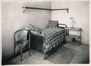
 Originally, one wooden shelf ran along the wall above the bed. It was held up on each side by a three-lobed plank or “festoon” cut. The architect chose to keep the shelf (after sanding, revision and painting) but also to reproduce the festoon pattern through modern reinterpretation. An inverted “festoon” designed by the architect adorns the bedroom desks and the basement’s kitchen bar.
Daylight
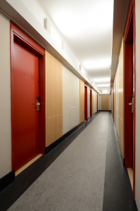
The corridors were originally lit through transom windows above each door that brought in light from the rooms, probably supplemented by lighting fixtures. For privacy or perhaps soundproofing, the transoms were soon filled in. The architect recreated electrical transoms by framing luminous panels in their place, lighting the corridors from above, as a reminder of the original design.

Colors
The original floors in the rooms and corridors were badly damaged and offered no acoustic comfort – footstep sounds resonated and spread by vibration into the rooms. The corridors were completely stripped bare and, after patching and insulation, covered with linoleum. In keeping with the original pattern, dark bands run along the walls on each side of a wide, marble-like gray band similar to the original marble-patterned concrete floors of 1930.
Textures
Terrazzo, the star material of the 20s and 30s, is still present in the House, for example on the steps of the staircases. Although it had disappeared from the basement decades ago, it was still there, hidden under layers of glass cloth and paint. Careful sanding, repairs and varnish brought it back to life, enhanced as it is by the choice of colors: bold green on the kitchen walls and pillars, a warm wood for the acoustic panels and furniture, and the earthy shades of the linoleum. Left: terrazzo on a pillar.
Objects
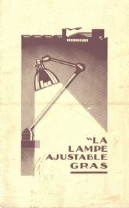
The architect chose a specific lamp to light the bedside and desk: the Gras lamp, an icon of the 20s and 30s. It was created in 1921 for industrial facilities, hence its sturdiness owing to the simplicity of its mechanics – no screws or welding – and an attractive, assertive design typical of the times.


Photos ©CiuP/DR | © Atelier Circonflexe Architectes | © DCW Editions


